Blackboard Learn is a web-based virtual learning
environment and learning management system developed by Blackboard
Incorporated which is an American Educational Technology (EdTech)
company. Around 11,990 companies software of Blackboard Inc. belonging
to industries such as Higher Education, Education Management, and
Information Technology and Services.
Being a Learning
Management System (LMS), Blackboard Learn gives an effective online
platform that makes it easy for students to keep track of their
coursework. Blackboard also facilitates collaboration among students
and teachers and supports remote learning, which is quickly becoming
the norm in today’s world.
Initial Analysis — defining Issues on the surface
Gathering information after an initial analysis, our own experience
using the platform for a year, and the annoyances we’ve heard from our
fellow peers, we dialed down on some notable issues to kickstart the
process.
-
Hierarchy and Contrast
The Blackboard
interface lacks proper hierarchy and contrast, affecting the
visibility and usability of available features. The dashboard
interface has numerous tiles and textual content with no appropriate
structure, which makes it hard to grasp the available content. In
addition, there is no way for the user to control the content
organization on this page to make use of the dashboard more
effectively.
-
Lack of reversal-of-action
Despite the
availability of Homepage and Refresh actions on the blackboard
interface, there is no inherent ‘back-button’ given, which leads to
a lack of reversal of action in the UI. The user instead has to rely
on the breadcrumbs component to go back which is not reliable in the
case of going back to a page that falls ahead in the information
architecture flow.
-
Poor Learnability
Another critical issue is
the poor learnability of the site. Users have difficulty
understanding how to navigate and make use of the features.
Learnability is an issue for any system and is a significant concern
as its effect is apparent at the initial onboarding stage. At this
stage, the users/customers are not yet invested in the system,
making it easier to consider a competitor, especially if they
encounter any issues.
User Interviews — diving in to find issues underneath
After researching the features of Blackboard and how it is used at
UMBC, we narrowed down two types of users. The first type of user is a
University Faculty Member – Professor, Teaching
Assistant, or Grader. The second type of user is a
Student who has access to the course-specific
information shared by their faculty. In addition to these course
specifics, students can also access their digital textbooks, track
their group work, and manage their calendars.
User Type 1: Faculty

-
20-30 years old
-
Teaching Assistant to their department professor
-
Pursuing their Ph.D. in Information Systems
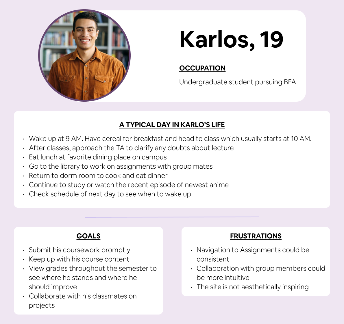
User Type 2: Student

-
19-25 years old
-
Background in Computer Science
-
Pursuing their Graduate degree in Data Science

For the interviews, we selected a user from each user type. In the
case of faculty, we had the opportunity to interview a Teaching
Assistant. The questions were designed to cater to a semi-structured
format interview. Our goal was to start the interview by understanding
the user’s frequency and context in which they use the software. The
structured part of the interview had questions that contained
specifics of their daily tasks. Based on their responses to these
questions, we asked unstructured follow-up questions. The interviews
were done virtually on Google Meet and recorded with the interviewee’s
permission.
Users reported feeling that Blackboard could be improved in terms of
functionality. While effective, there's a learning curve to the
interface, requiring initial help from peers. Additionally, users
expressed a desire for more customization options.
Specific frustrations
-
Teaching Assistants struggle with the assignment grading
queue. The random shuffling makes it difficult to track
ungraded work and sort efficiently.
-
Students find the lack of a "back button" on the
course page annoying. Navigating to deeper levels often leads
to closing and reopening the entire course window to return to
a previous page. Students also overlook the clickable
breadcrumbs for navigation within the course.
Interestingly, despite the variety of features offered, students
rarely explore them. Additionally, student expectations include some
standardized elements on the course homepage, regardless of instructor
customization. An example is easy access to instructor and TA contact
information.
In conclusion, we gathered valuable information from these interviews
to help us improve Blackboard. We plan to tackle the learnability of
the site by updating the navigation of the interface. Additionally, we
feel a platform serving primarily students should have a more
interactive user experience. This can be approached by updating the
aesthetics and improving upon the platform's rigidity.
Heuristic Analysis — understanding daily tasks and how
they're affected
Conducting a Heuristic Analysis helped us uncover specific features of
a page that users were having trouble with. We analyzed it with the
participation of five different users. Three users were students,
whereas the other two were faculty members. The results from the
analysis also helped us narrow down specific user flows to work on for
the oncoming prototyping phase. Some of the results are included below
-
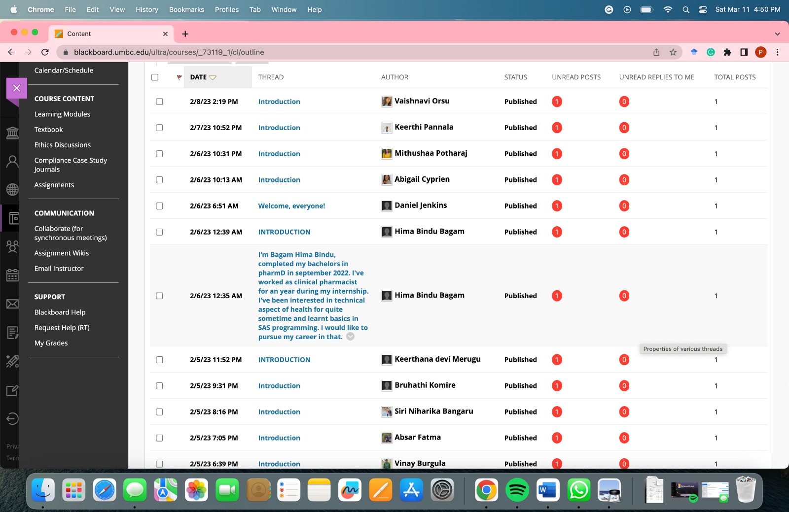
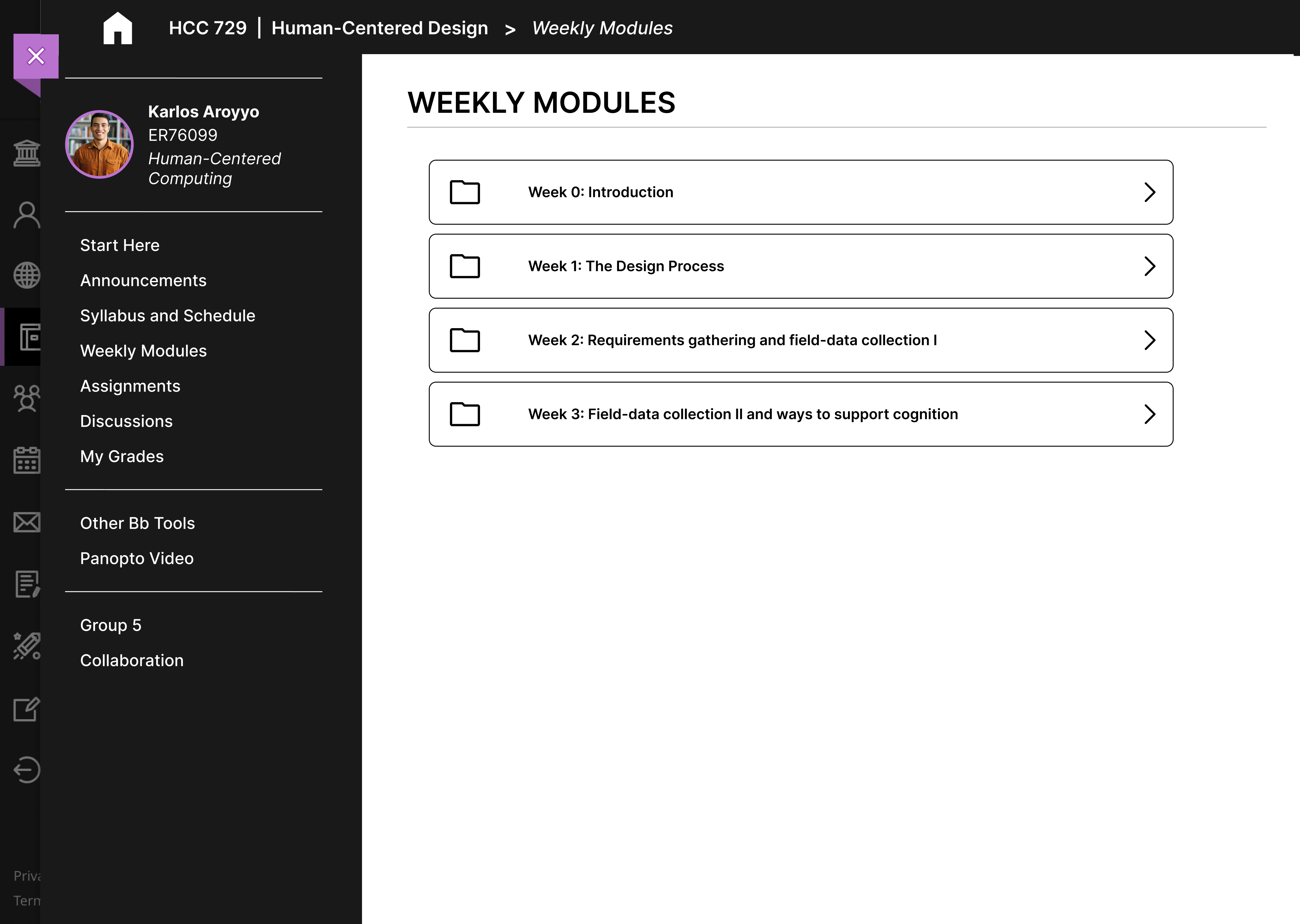
Navigating to the previous page is difficult
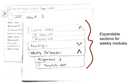
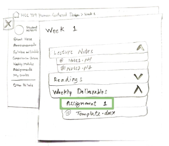
Blackboard Course Modules
"Create Thread" - not visible as a button
Aesthetic and minimalist design
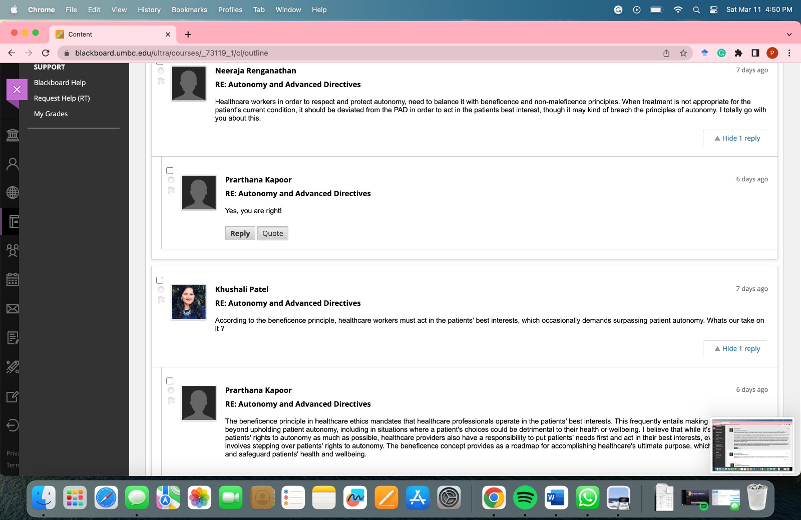
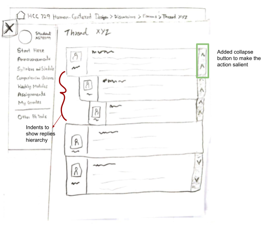
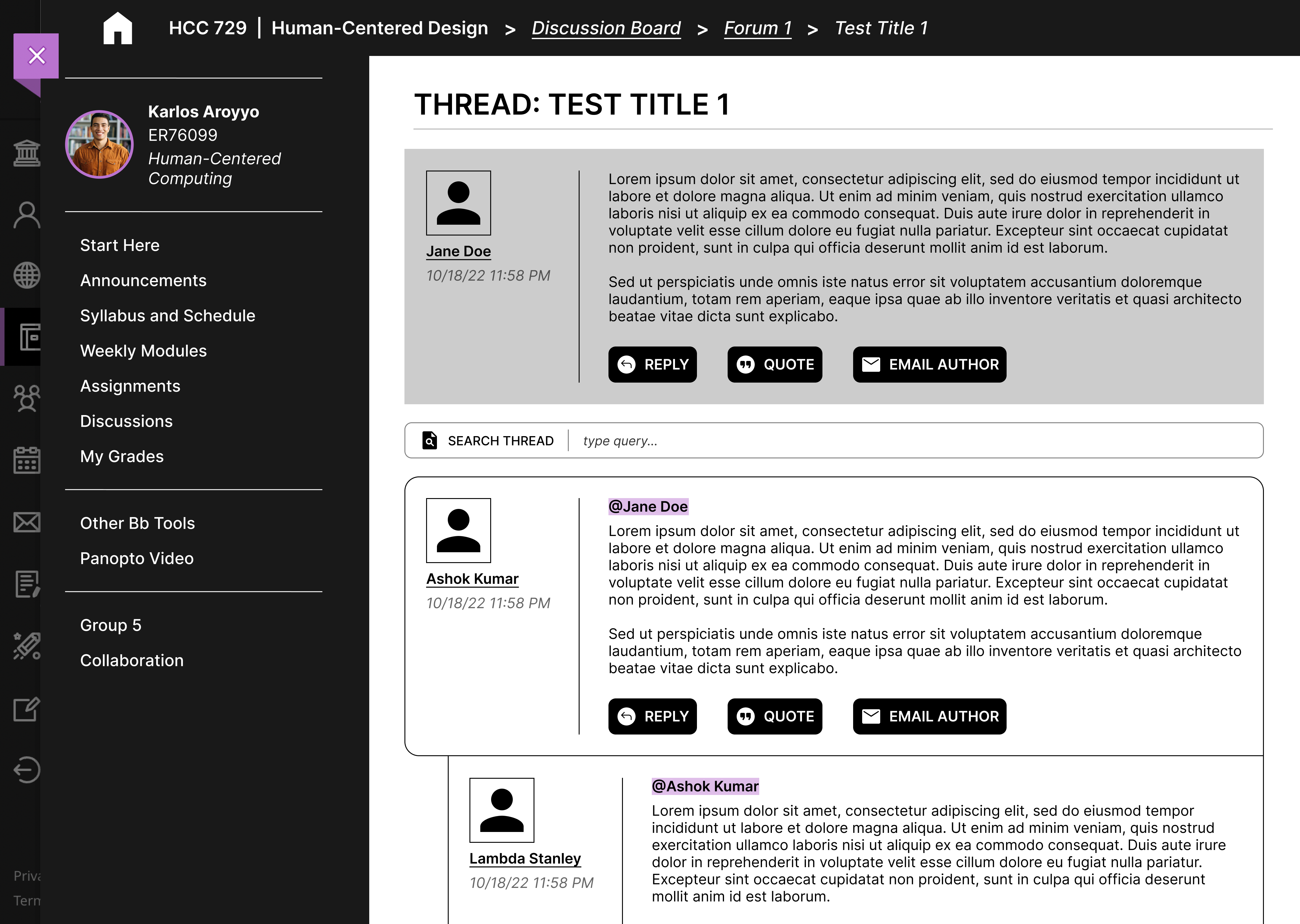
Hard to find user’s own post among others’ posts
Flexibility and efficiency of use
Recognizing item hierarchy in forum posts
Consistency and Standards
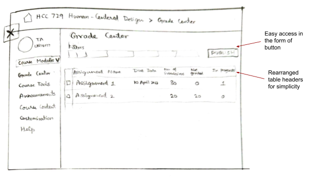
Hard to recover from errors when grading
Individual assignment grading
User personas — Stepping into the shoes of users
Taking the insights from interviews, we created user personas with the
goal of helping us empathize better with the users we were designing
for. We came up with two primary personas, one each for a Student and
a Faculty member.
competitor Analysis — What is lacking? what works well?
While performing competitor analysis for Blackboard, we gathered the
pros and cons of each competitor with respect to the six usability
goals. The assessment was done by going through each platform, which
was made possible either by direct access shared by
friends/acquaintances from other universities or through demos made
available on the platform's website. Analysis of reviews of each
platform was also done by going through the information available
through Google Reviews and
G2 Reviews.
Assessing competitors of Blackboard in terms of Usability Goals
competitor
x
Usability goals
+
Direct messaging for teachers & students
-
No native Announcement feature support
+
Bookmark module contents
+
Can access recent pages through History
-
Large amount of content under Modules requires scrolling
-
Course home page content is just a long scroll
+
Bookmark module contents feature
+
Browse recently accessed pages
-
Inefficient use of space
+
Bookmark module contents feature
-
Unable to edit assignments once posted
-
Lack of official documentation
+
Google suite integration
-
Forum discussion not available
+
History feature shows recent activity
+
Lots of customization possible
-
No separate Assignment page
+
Course tools are easily accessible
+
Module relevant discussions
+
Important Dates page for Assignments
+
Consistent material design
-
Adding announcements is not clear
-
Configuring courses is confusing
+
Intuitive navigation and layout
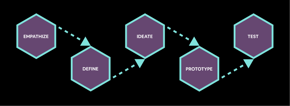
For the prototyping phase, we decided to focus on three user flows.
Prior interviews and analyses informed the factors we considered when
choosing these flows. Other factors include frequency of use and
usability score from the Heuristic Analysis.
To get started on refining the prototypes, we gathered participants to
have them conduct a Cognitive Walkthrough with the low-fidelity
prototypes. This exercise was a great way to verify whether the
designed prototype helped address the issues we discovered during the
Heuristic Analysis. It also gave us an insight into the mental model
of the users while performing the specific tasks we defined earlier.
Below is the cognitive walkthrough analysis taken from one of the
users.
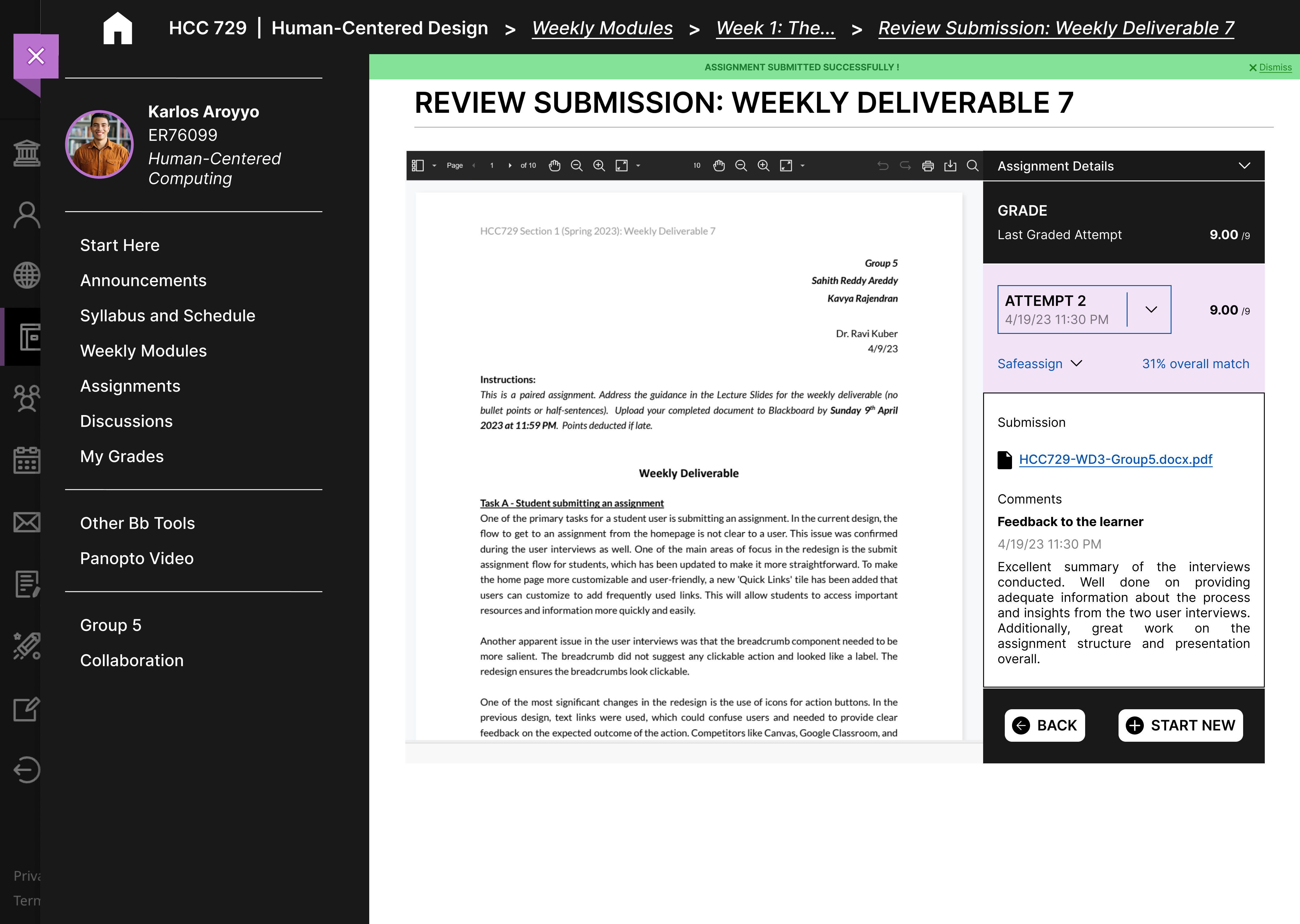
What was the user’s goal?
Does the action or label match the goal?
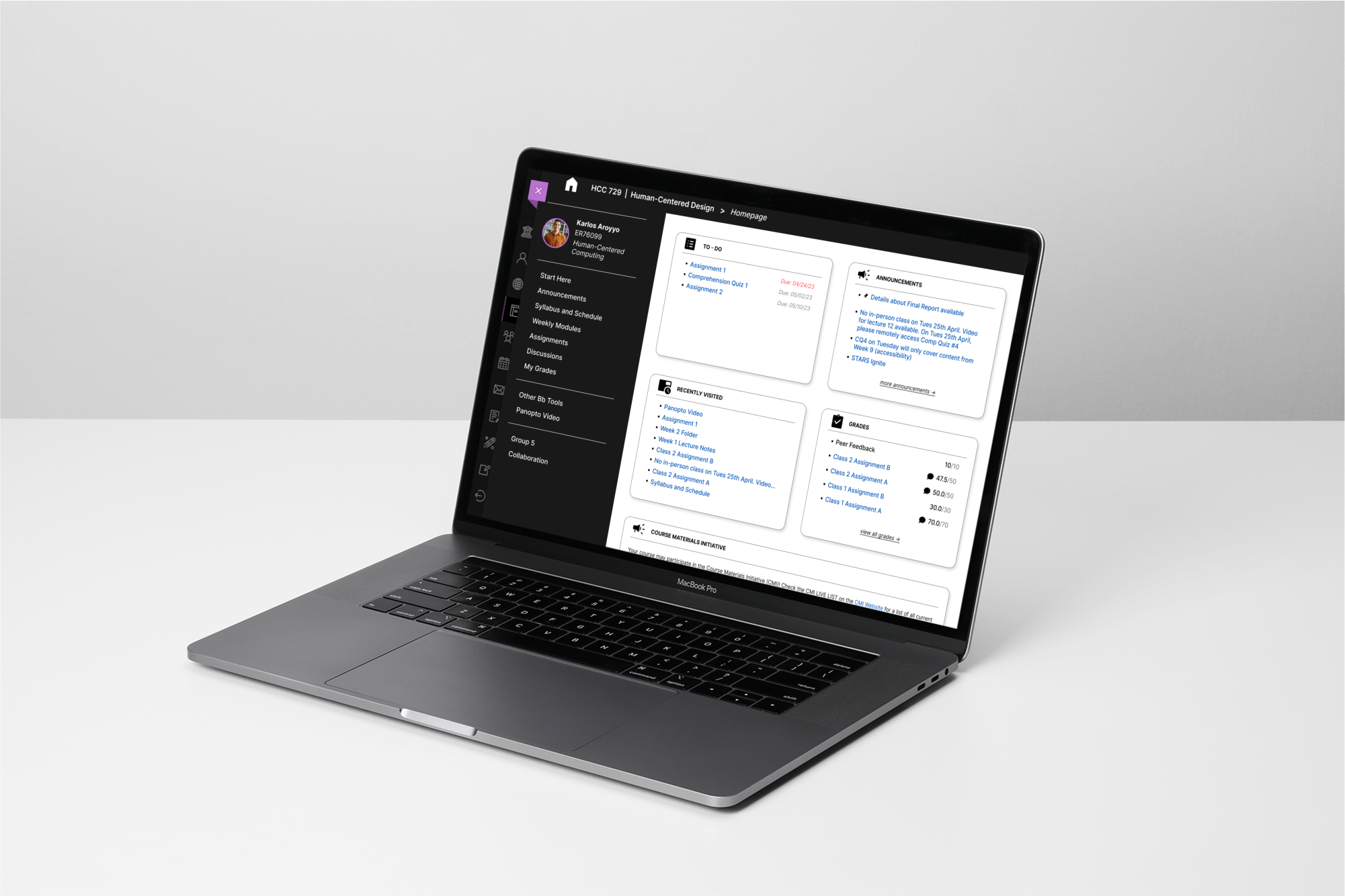
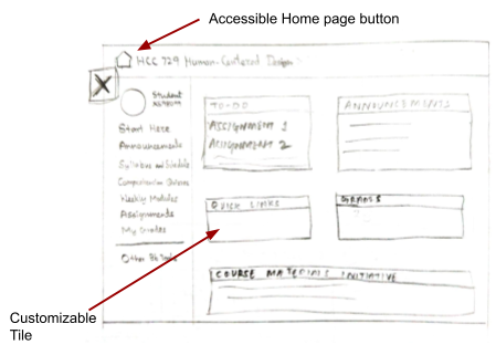
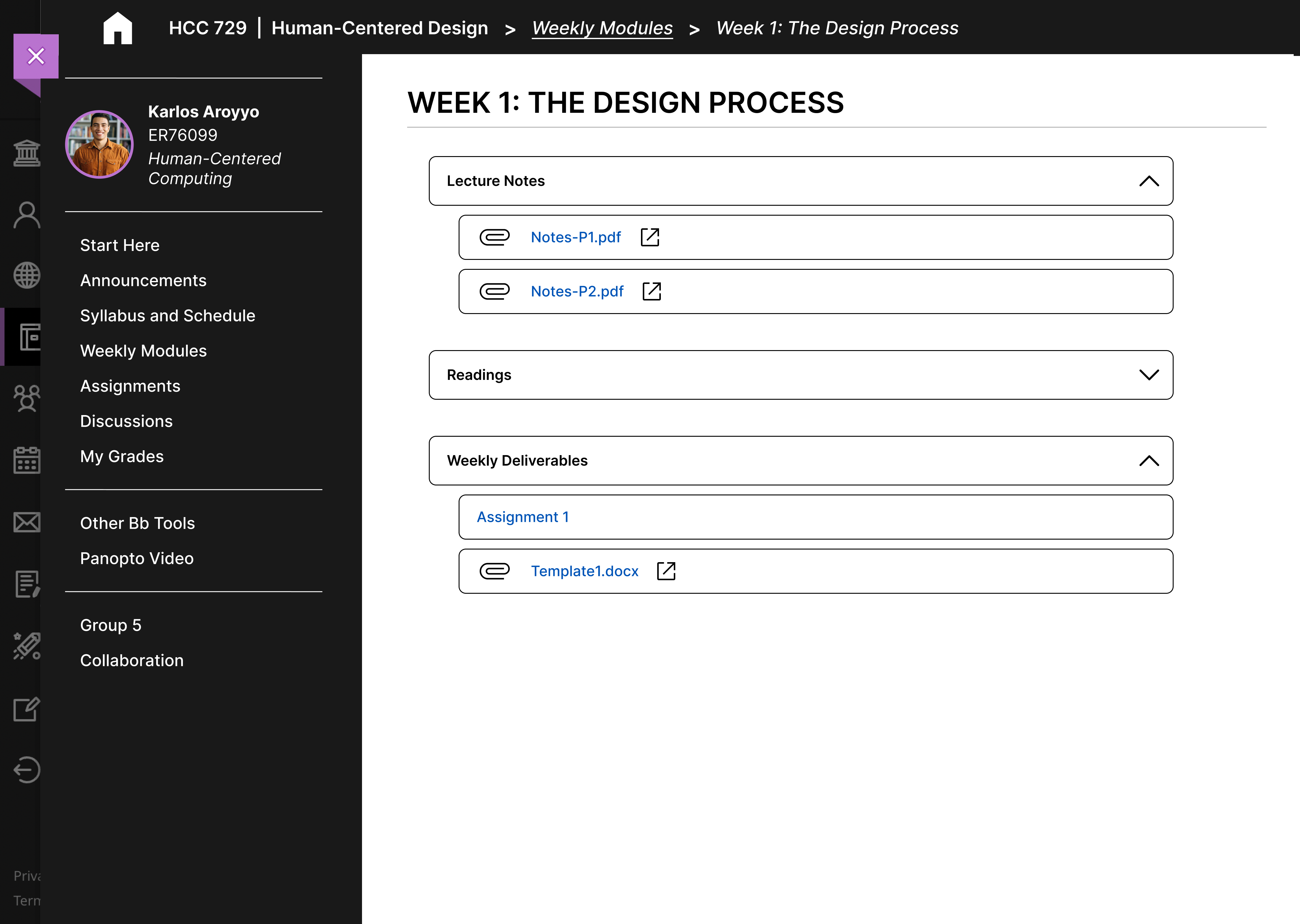
The user is on the Course Homepage. Their
goal is to find a link that will take them to a page where
they can submit their due assignment
There are two available actions on the page. One action is
part of the ‘To-Do’ tile on the homepage, and another is a
link on the sidebar. The user made use of the ‘To-Do’ tile
and clicked on the link for the pending assignment.
The relevant link available to the user is in the ‘To-Do’
tile has the assignment name and the second actions is an
‘Assignments’ link on the sidebar.
Once the user selects the relevant link, the page title
and breadcrumb on top of the page informs them of their
current location.
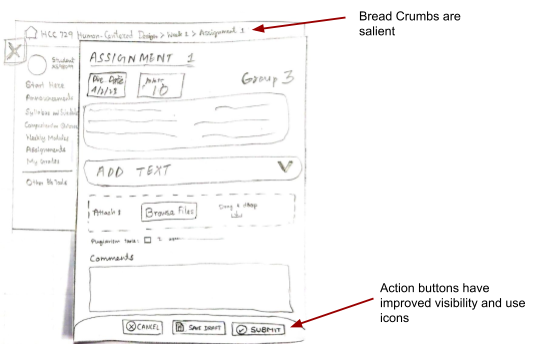
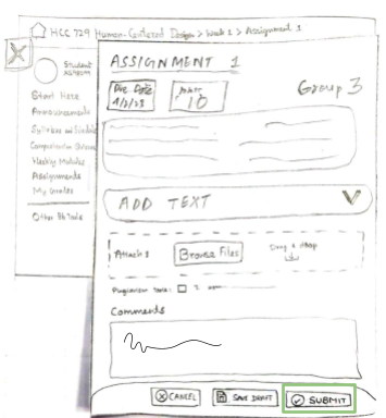
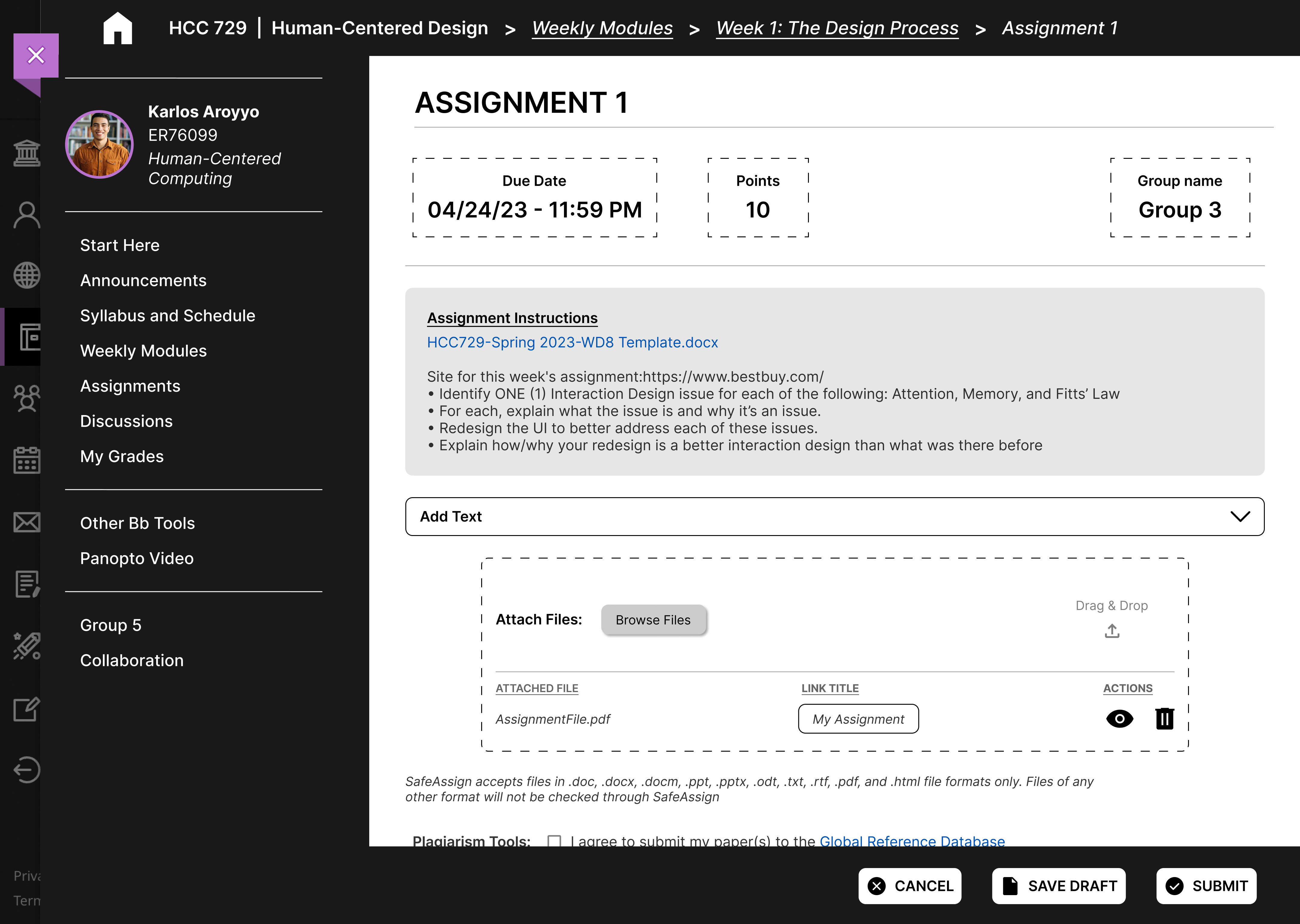
The user is on the
Submit Assignment page. Their goal is to
add their content to this page.
The page has relevant signifiers that suggest the user to
add text content or attach files. The user attached a
file for their assignment.
The components on page have ‘Add Text’ and ‘Attach
files’/’Drag and drop’ labels to suggest input actions to
the user.
A textual content added is seen in a textbox to the user.
If the user attached any files, the respective element
shows the file name and possible actions.
Since content is added, the user now wants to
Submit their assignment.
The sticky bar has a submit action available for the user.
The user clicked the submit button to complete the task.
The button with label ‘Submit’ and a relevant icon makes
the action more visible and matches the goal.
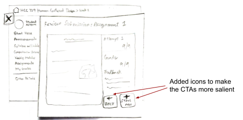
After clicking on submit, the user sees a success banner
message. They're also redirected to a ‘review
submission’ page, which reinforces the idea that their
assignment is submitted.
What was the user’s goal?
Does the action or label match the goal?
The user is on the Course Homepage. Their
goal is to create a thread on a certain discussion forum.
There is an action available on the course sidebar which
is relevant to tasks relevant to the discussion feature.
The user found this action easily.
The link on the sidebar has the label ‘Discussions’, which
is relevant to the task at hand.
Once the user selects the relevant link, the page title
and breadcrumb on top of the page inform them of their
current location.
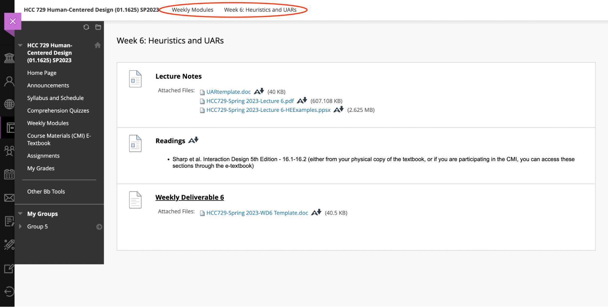
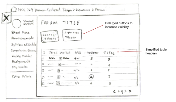
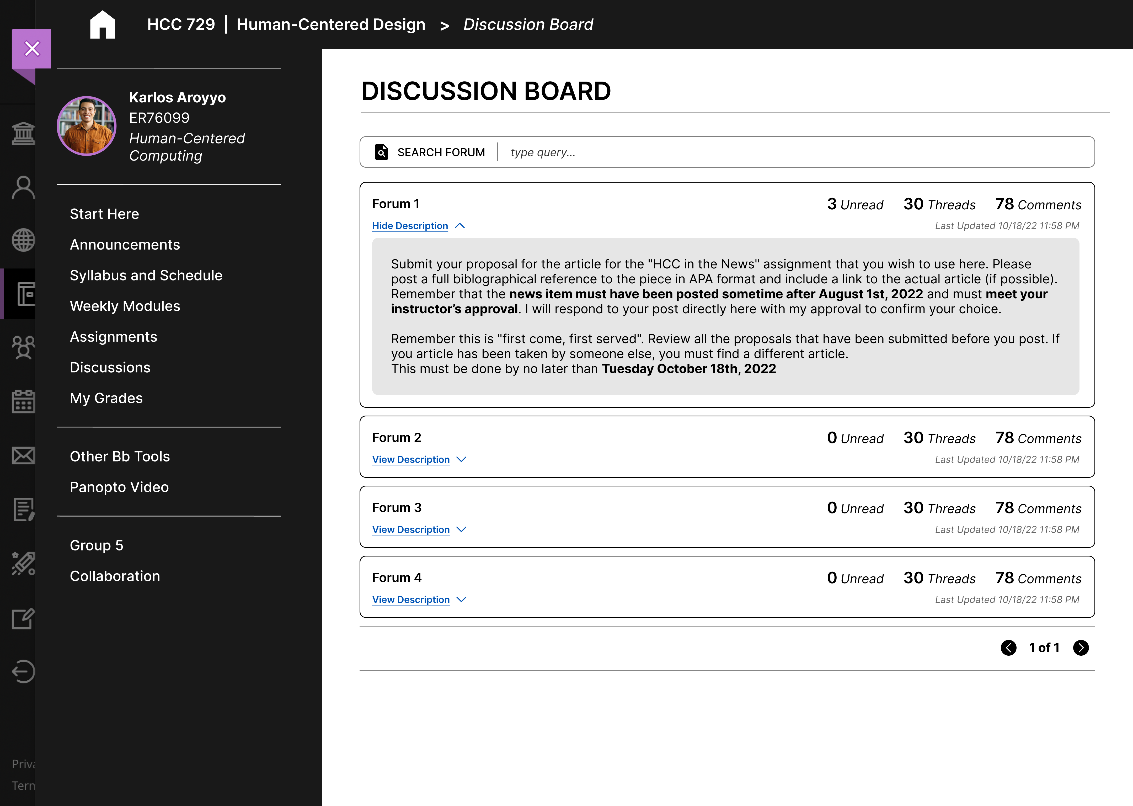
Now on the Discussion Board page, the
goal of the user is to select the specific forum they want
to create a thread in.
On this page, the user sees a list of forums available for
the respective course. They have to select the forum they
need. The user selected the required forum.
Each value in the list has the forum’s title and
description that informs the user of its contents.
Once they select a forum, the page title and breadcrumb on
top of the page inform them of their current location. The
description at the top of the page adds to the feedback.
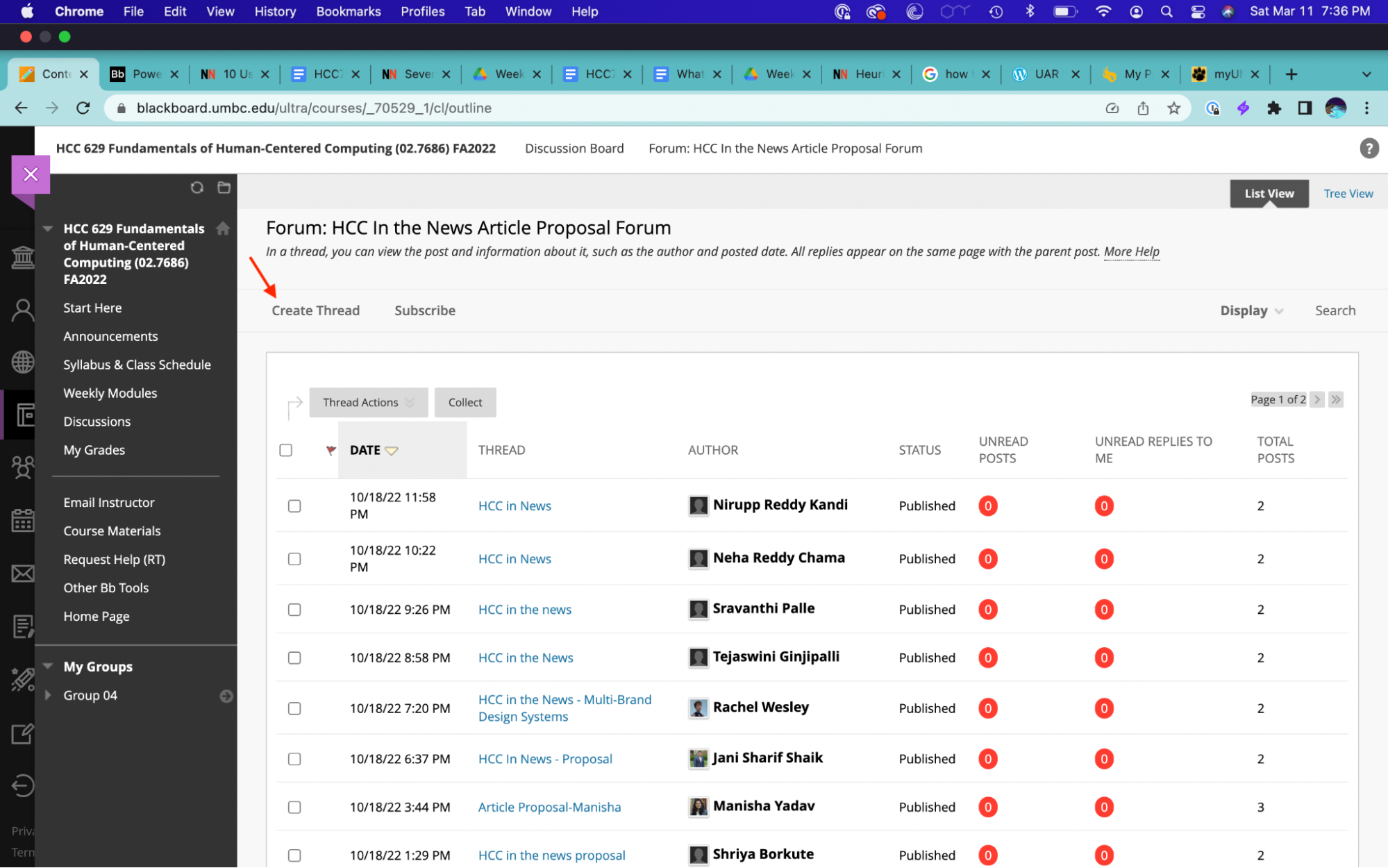
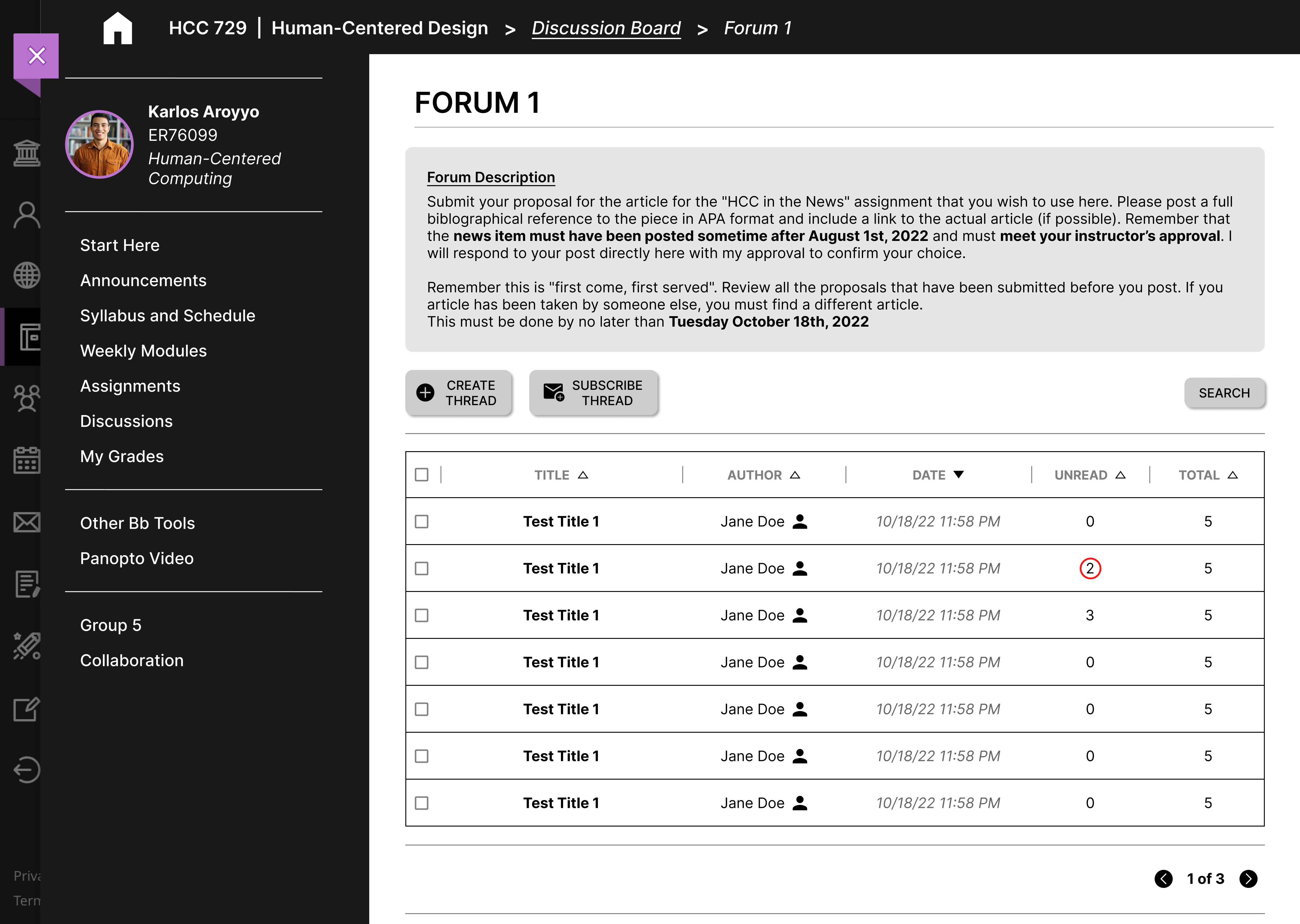
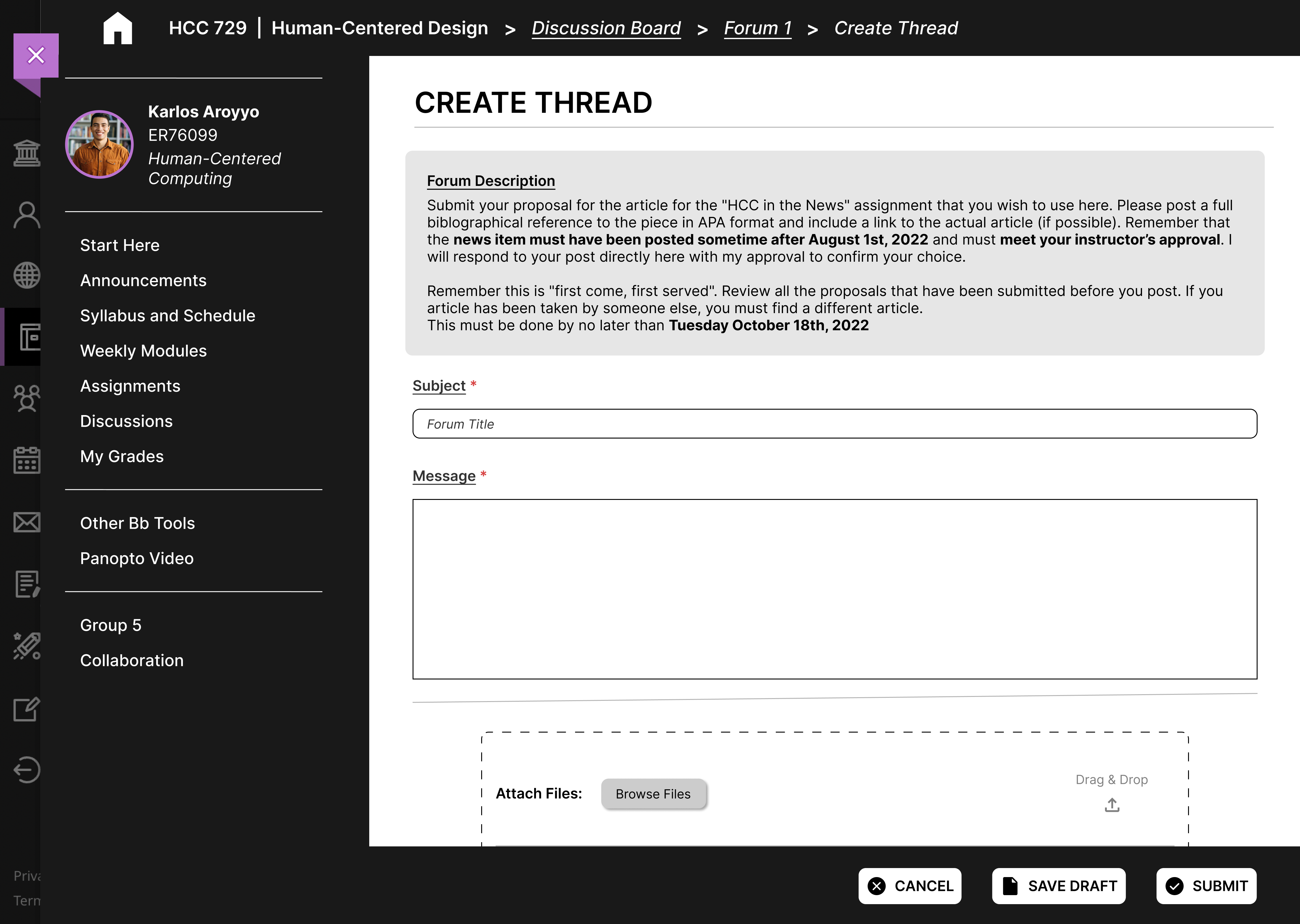
Now on the Forum page, the user’s goal is
to create a new thread in the forum.
The action to create a new thread is possible through an
action button available on the page. The user clicked on
the button.
The action button has the label ‘Create Thread’ and makes
use of a ‘+’ icon that makes it easy for the user to
recognize the action.
The page title and breadcrumb on top of the page inform
the user of their current location.
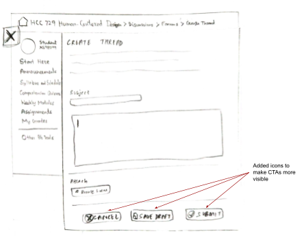
The user is on the Create Thread page and
their goal is to add their content and finish creating a
new thread.
The action to add content is available through the textbox
and textarea components on the page. The user can then
submit using the action button available on the sticky
bar. The user clicked on the button.
The textbox components along with the titles signify the
user to input their content. The button with label
‘Submit’ and a relevant icon also matches the goal.
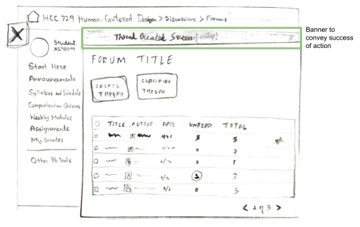
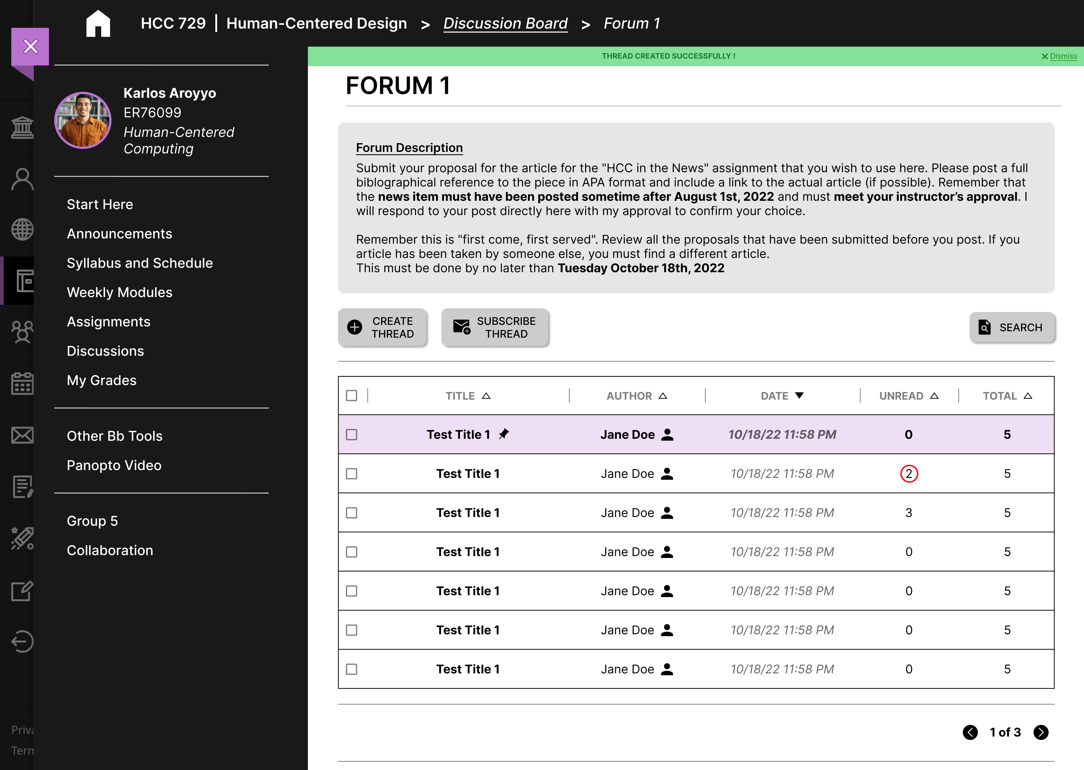
Once the user submits the thread, they come across a
banner message and see their thread on top the threads
table. Their thread has a pin icon and uses a contrasting
color.
What was the user’s goal?
Does the action or label match the goal?
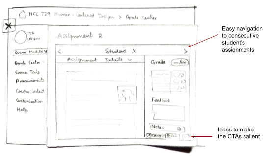
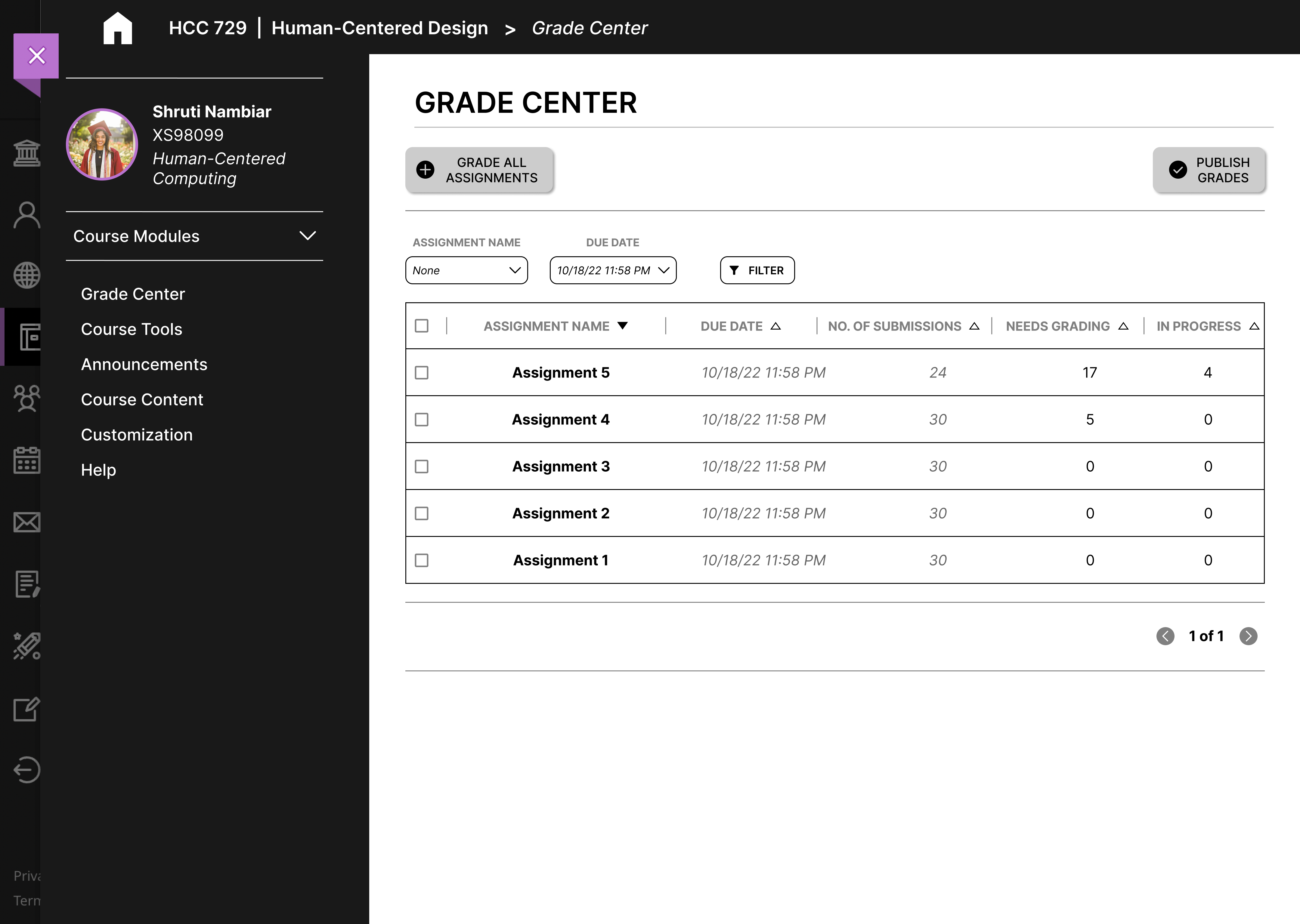
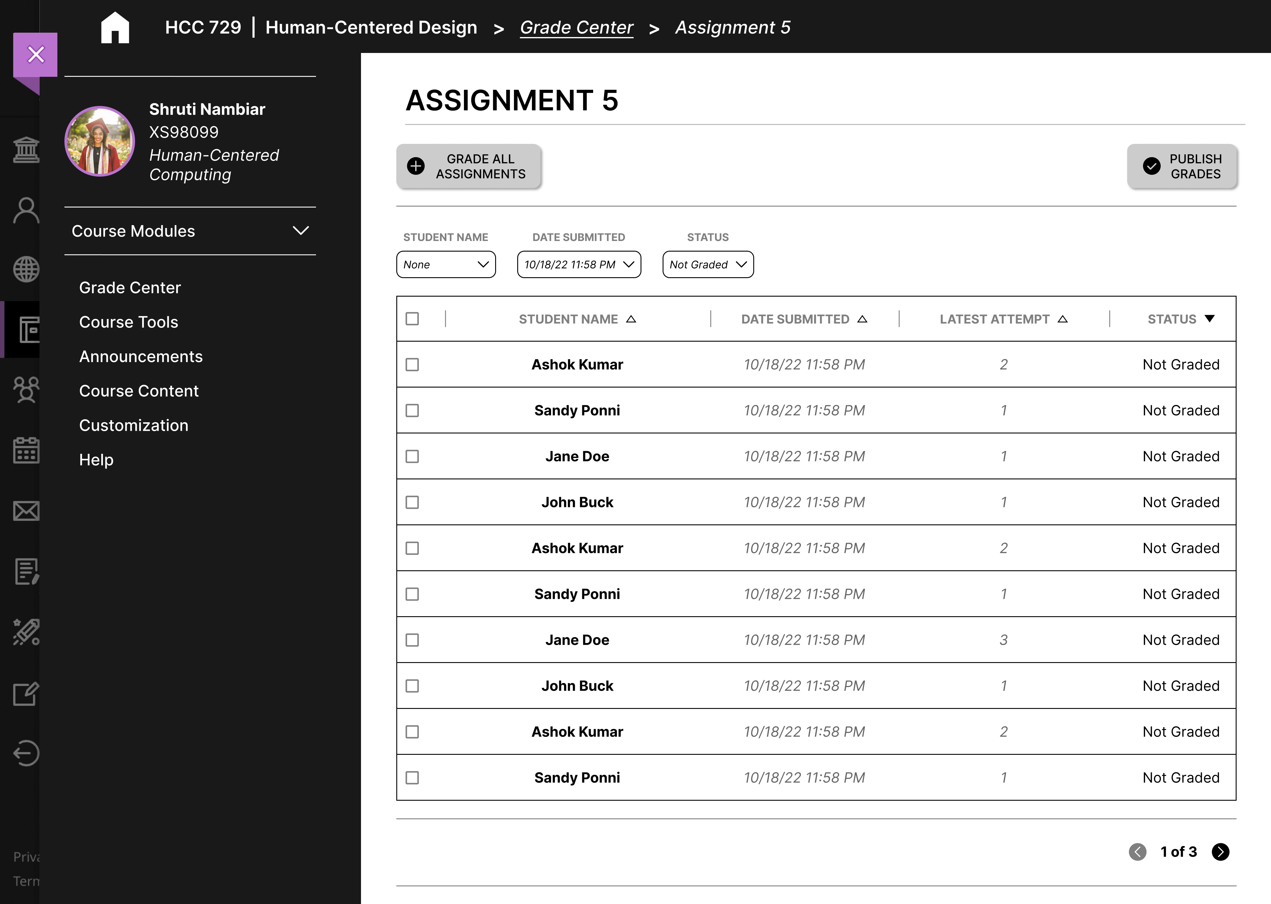
The user is on the Grade Center page.
Their goal is to grade an assignment.
The user sees a list of assignments on this page. The user
clicked on the required assignment.
The list of assignments has each assignment’s title that
helps facilitate the user’s task.
Once the user selects the relevant link, the page title
and breadcrumb on top of the page inform them of their
current location.
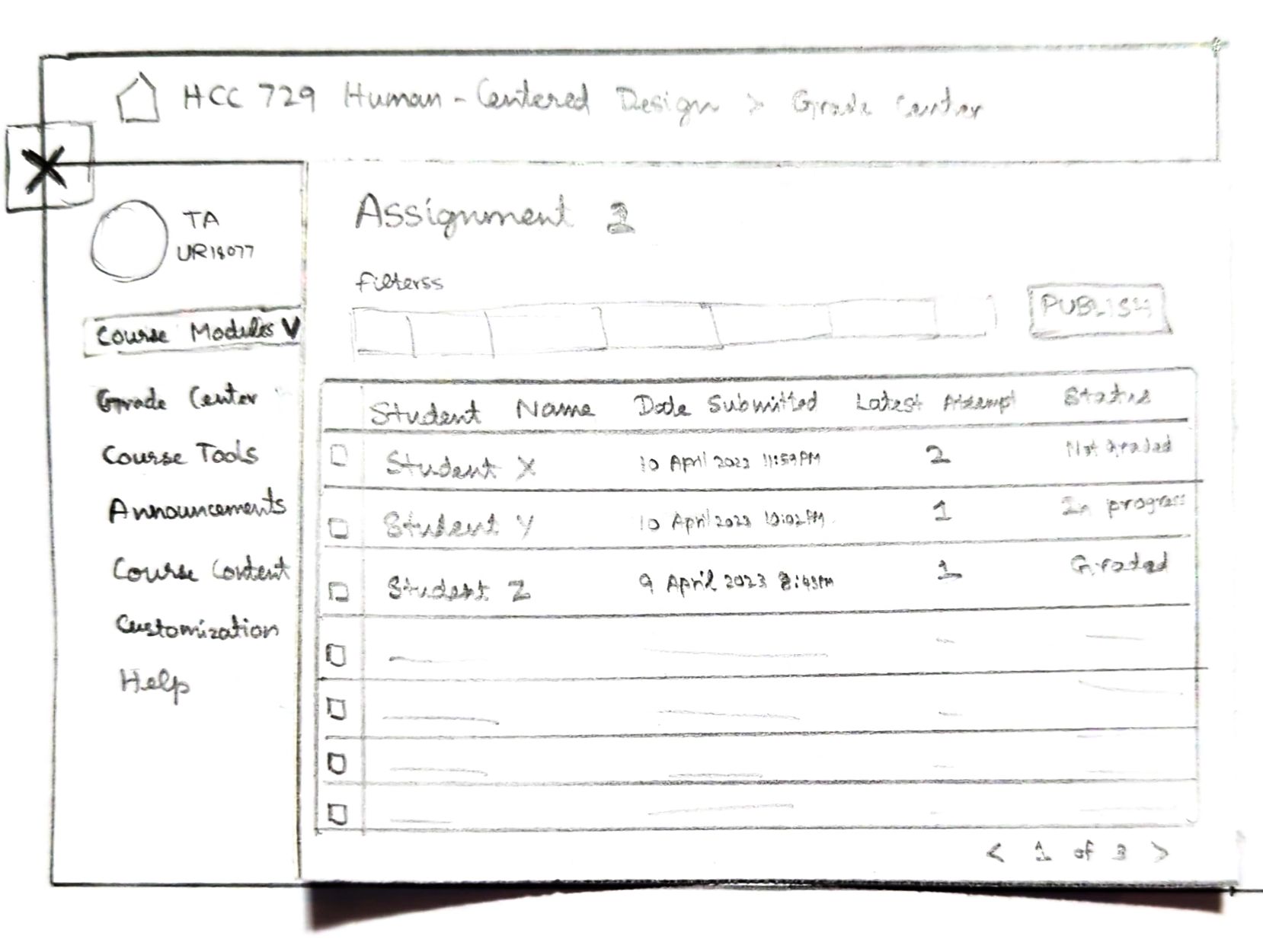
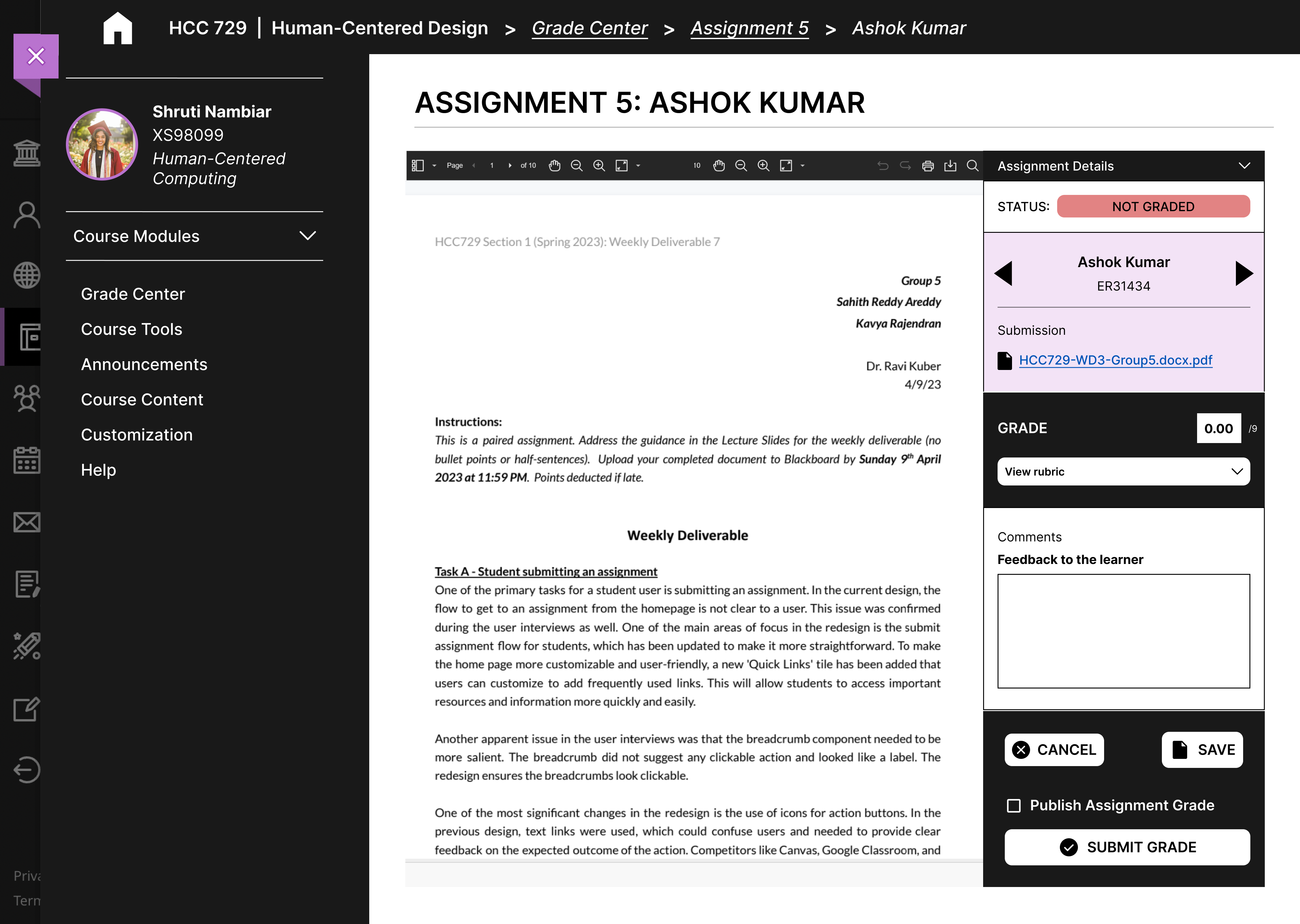
Now on the specific Assignment’s page,
the user’s goal is to start grading.
The user can either start grading using a generic action
button or select a specific student’s assignment. The user
clicked on the student of the table.
The action button has the label ‘Grade all assignments’
along with a ‘+’ icon. The table contains a list of
students’ assignments with their names.
Once the user completes the action, the page title and the
breadcrumb inform them of their current location. The
following page also shows the assignment contents.
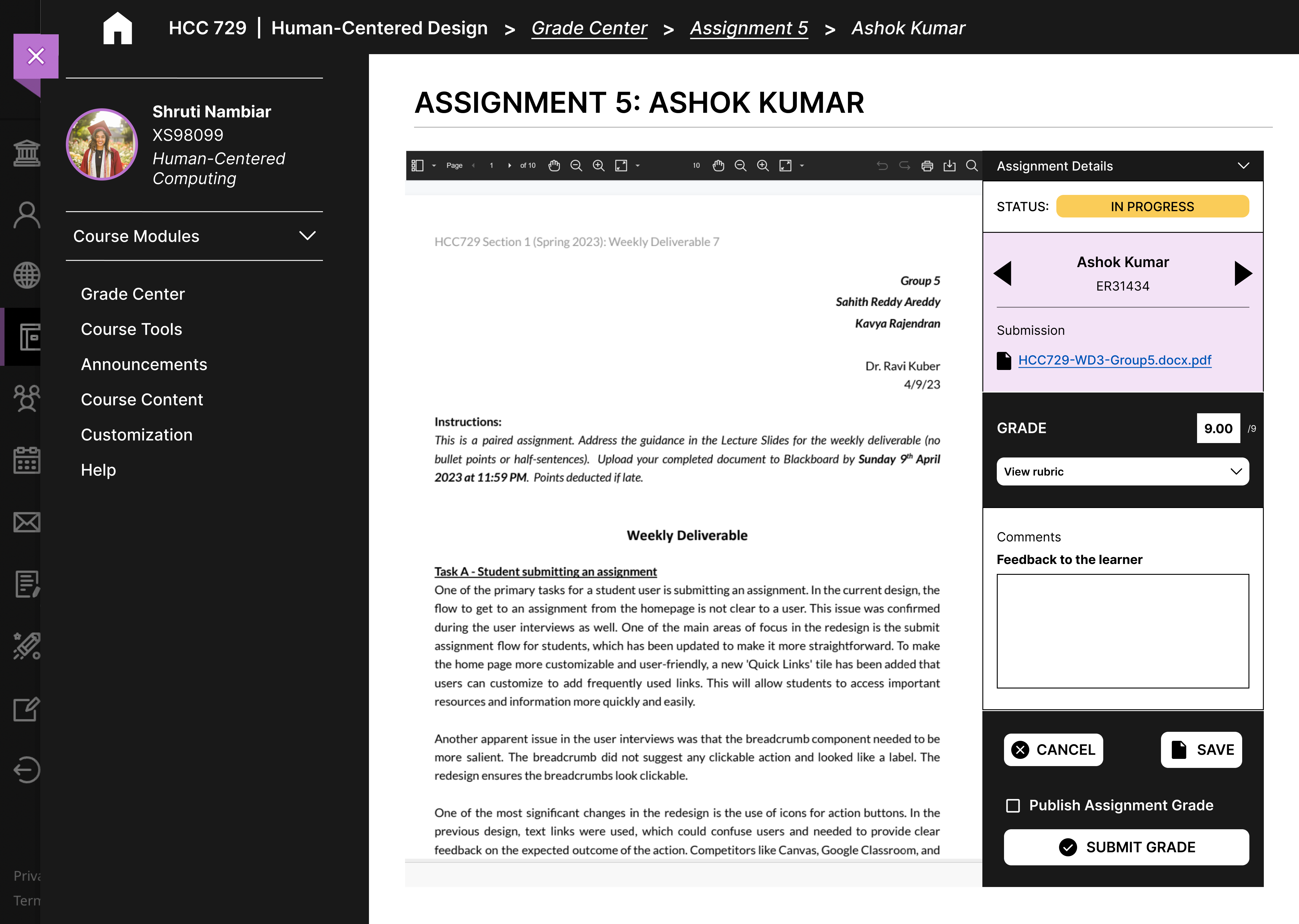
The user now
sees the assignment contents of a
student. Their goal is to go through the contents and give
a grade to the assignment.
The assignment contents are available on an embed pane.
There is also a textbox to input the grade. The user input
a grade and noticed the status change.
The embed pane shows the assignment contents. The textbox
has the label ‘Grade’ that informs the user of its use.
The status of the assignment changes to ‘in progress’
informing the user their work is recognized. The user also
sees the grade they input in the textbox.
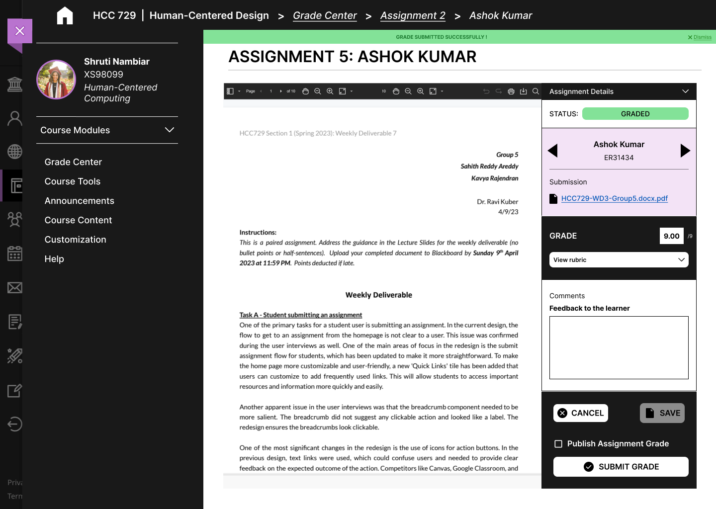
Since the grade has been inputted, the user now wants to
Submit the Grade.
The action is available through an action button. The user
clicked on the button.
The action button has the label ‘Submit Grade’ and uses
the checkmark icon to inform its use.
Once submitted, the user sees a banner message informing
them the grade was submitted successfully.
High-fidelity prototyping
For the prototyping phase, we decided to focus on three user flows.
The factors we considered when choosing these flows were informed by
prior interviews and analyses. Some factors include frequency of use
and usability score from the Heuristic Analysis.