Homepage HERO section of the redesigned website

Tourism Website Redesign

Ui DESIGN
.
Branding
.
visual identity
Project Summary
hyderabadtourism.travel is a tourism website for the city of Hyderabad, located in India. The website is maintained by HOLIDAYS DNA, a travel package and hotel booking agency. The website is an indirect advertising platform for their services pertaining to Hyderabad. The current 
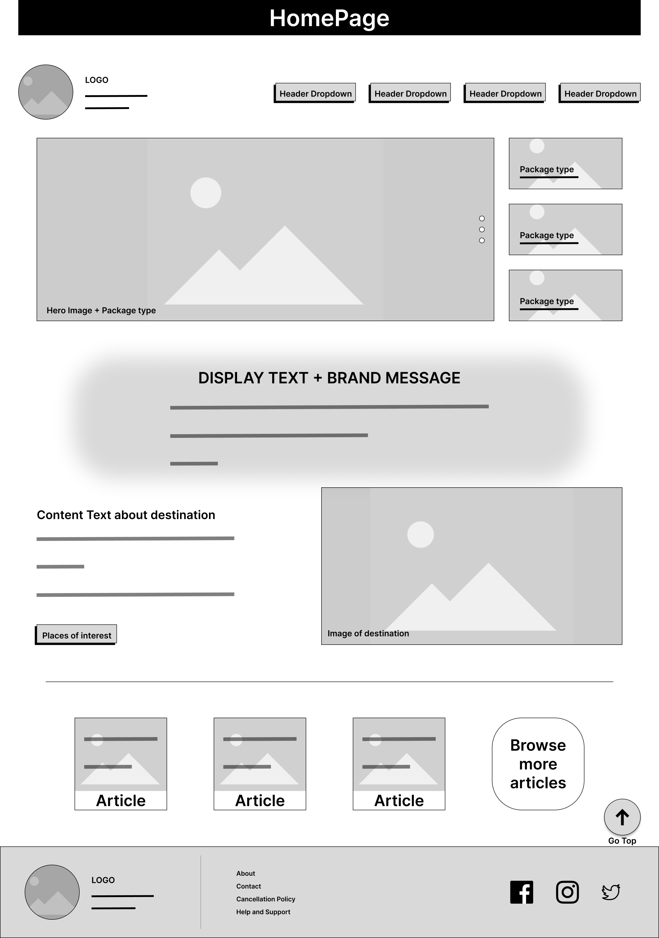
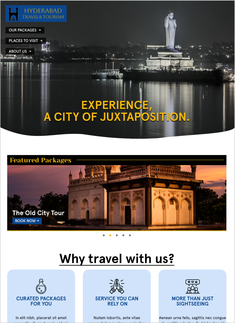
design is very bland and doesn't look like a tourism website. 
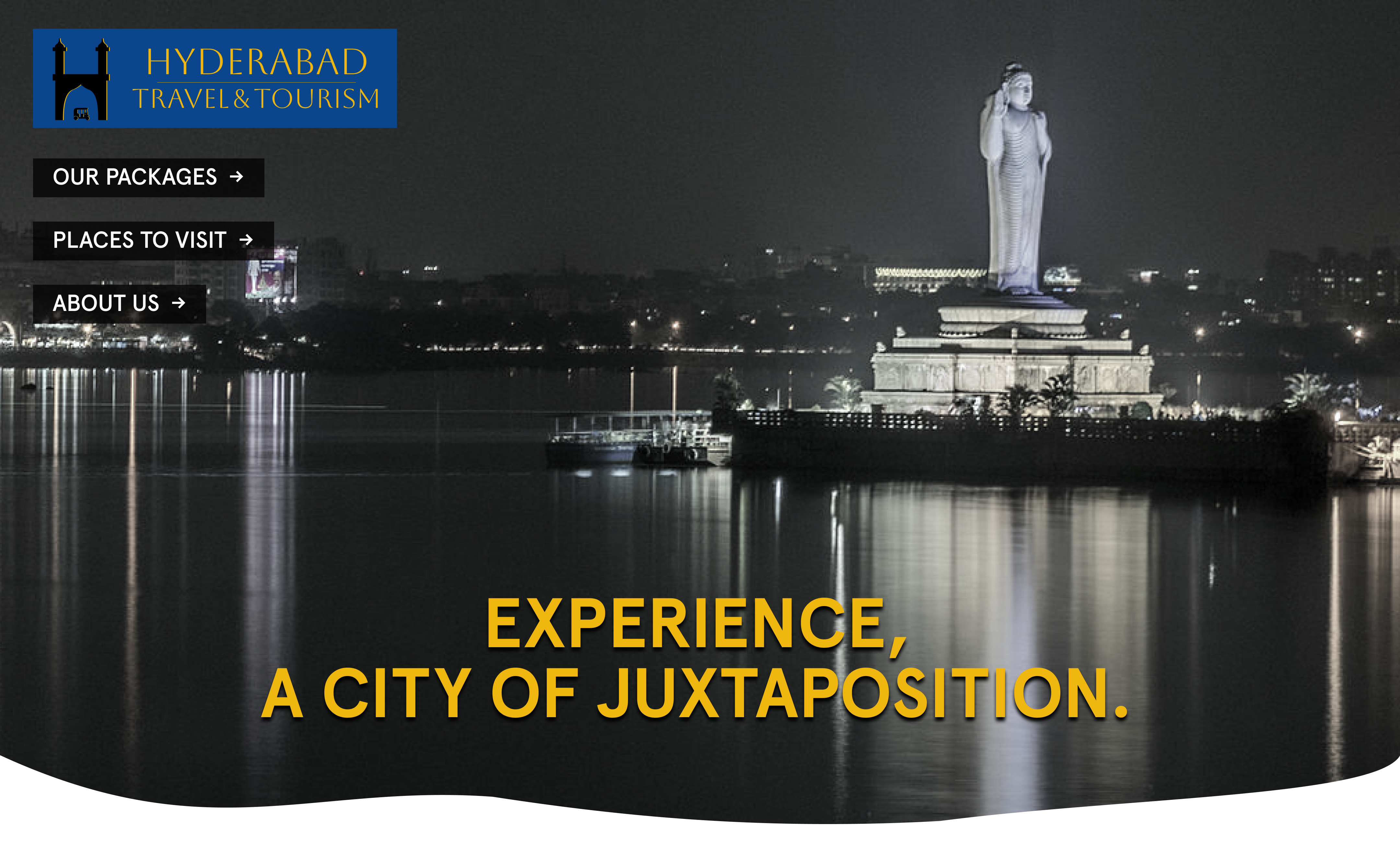
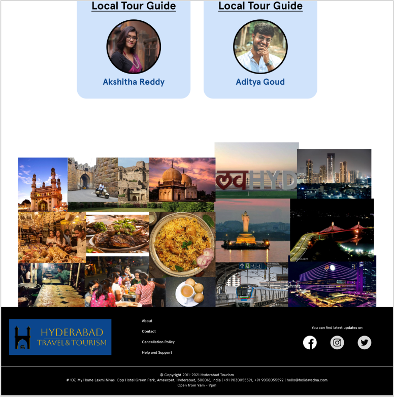
My goal was to redesign the website to make use of proper branding and images to evoke emotion in a potential customer as a tourism website should.
MOTIVATION
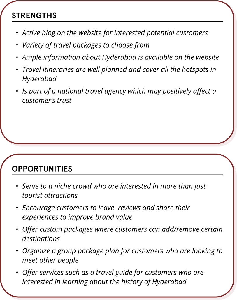
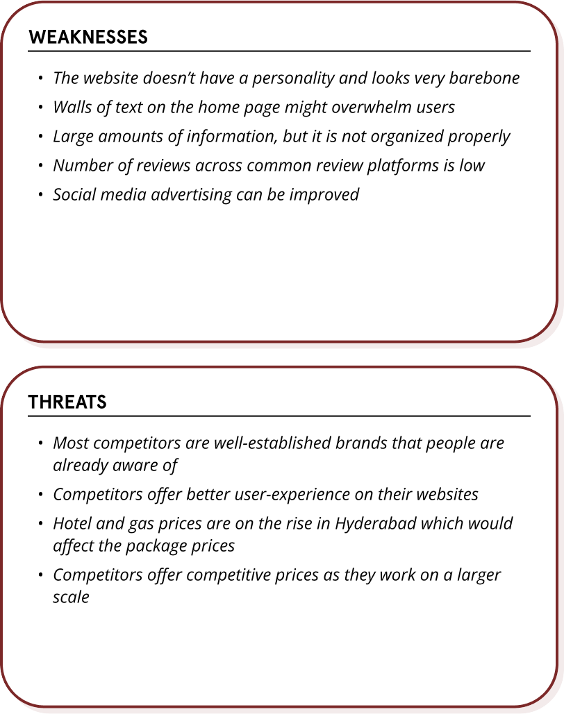
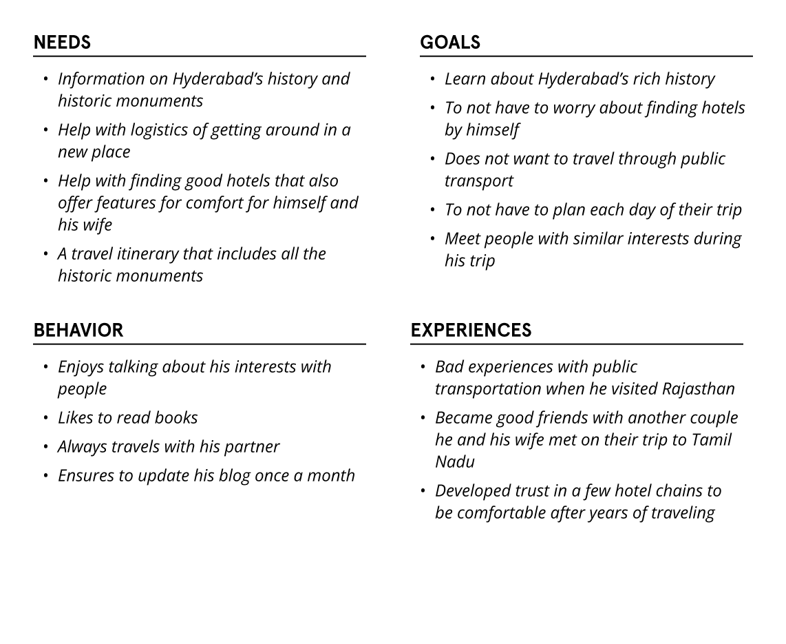
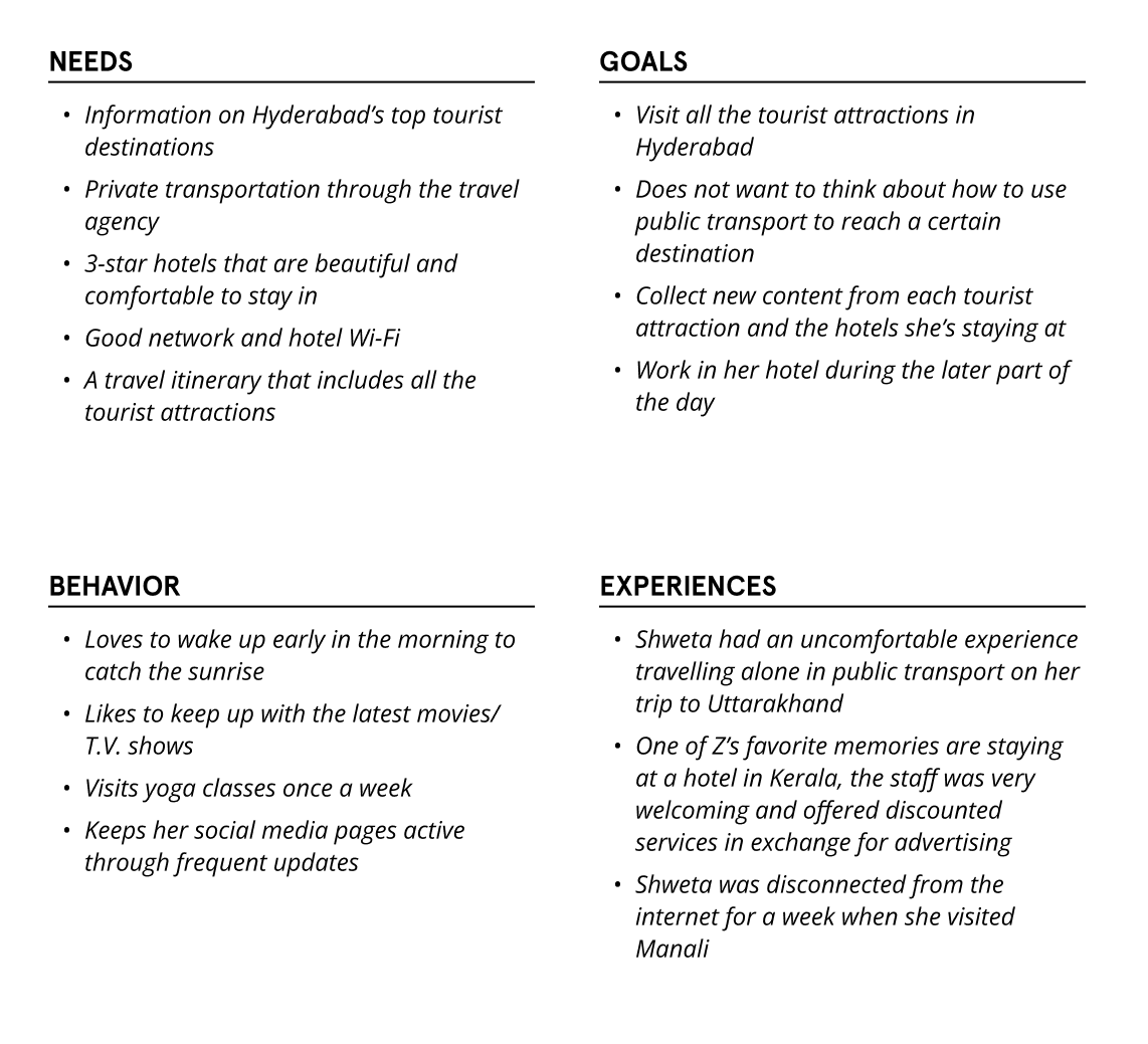
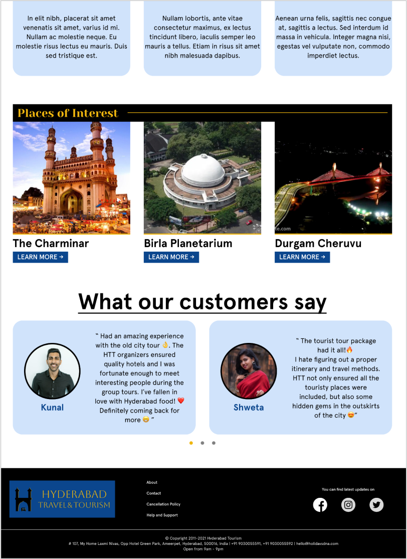
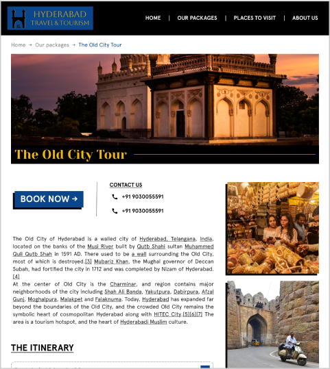
The current website has adequate information about the city, but it fails to invoke any emotion from the user, something I believe a travel website should do. The advertising on the website pertaining to hotels is not subtle and feels forced, which might drive some potential customers away. I believe prioritizing information about the city first, and advertising second, would be more effective in helping serve the website’s purpose. The website also feels bland in 
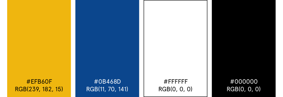
terms of layout and other visual elements, such as typography and 
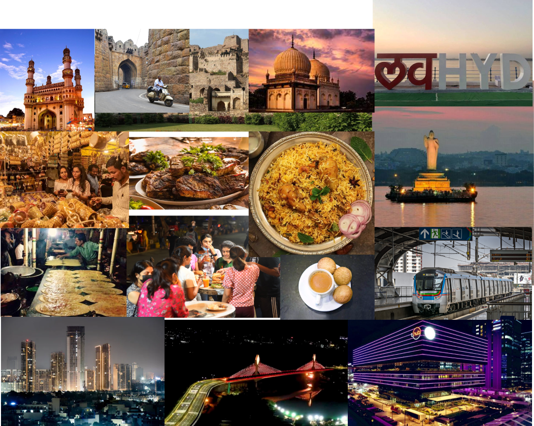
colors. Hyderabad is a city with a rich history and has more to offer than the technology parks and skyrises it's known for today. One of my goals is to integrate this element of history into the website and strive to increase user engagement. I also want to include design decisions that would target a specific audience of travelers, which would be an improvement from the more generic design the website currently has. Also, being from Hyderabad myself, I feel motivated to improve a website trying to promote my city.
What I learned through the process
  • How to communicate intent through color, typeface, and logo branding
  • Maintaining a design system in Figma incorporated with the brand identity to keep consistency in designs
  • Importance of SWOT analysis to identify weaknesses and opportunities over competitors
  • How to create effective User Personas to introduce customer needs into the design process
  • Importance of prototyping and building Low-Fidelity wireframes to gather initial feedback while keeping investment to a minimum
Moodboard
Moodboard to get the right vibe
One of the integral aspects of traveling is the experience of the destination. Hyderabad offers unique experiences across many aspects that make it an enticing place to visit. One of the strengths of HTT over its competitors is that being a local brand, HTT offers a more authentic and personal experience to its customers. The mood board represents feelings from 3 unique perspectives of the city - History, Food, and Modern Life. Since HTT would be selling experiences, visual elements such as pictures will play a vital role on the website. The historical aspect of the city can be shown through pictures of famous monuments such as the Charminar and parts of the Golkonda fort, are shown through images of various foods and gatherings are shown through images of various foods and gatherings which have merged seamlessly with the modern parts of the city. The cuisine and street food culture is shown through images of various foods and gathering of people who are enjoying each other’s company over delicious food. The Modern aesthetic of the city is conveyed through modern architecture such as huge tech buildings in the city.
Brand Design
Typefaces for the redesign
Hyderabad is a city of juxtaposition with the old and the new existing together. I wanted to integrate this aspect into the brand design. Keeping this in mind, the typeface Aboreto felt very fitting with the theme. The typefaces Yeseva One and Apercu Pro also worked well together to maintain this specific aesthetic.

The brand being a travel agency, I wanted to add a feeling of luxury & sophistication as well. I wanted the primary color that I’ll use as part of the redesign of the website to evoke a sense of heritage & history. With this goal, I initially worked with a deep brown that evokes a feeling of history while also maintaining a sense of royalty. The turmeric yellow is contrasting and is taken directly from the flag of the last-standing empire, bringing a sense of royalty. These two colors on a black background fit perfectly with the aesthetic of history and the culture of Hyderabad. Using these two colors, I landed on a bright blue using the triadic color harmony. I felt this blue was perfect to show the contrasting modern part of the city and also helped to add a contemporary aesthetic to the brand when included in the logo.

For the final palette, I put aside the brown as I wanted to integrate black and white into the final color palette. I planned to use the brown as a background, but the result was not what I had expected. Sticking to this four-color palette worked well to keep the brand's identity modern - while also retaining a sense of history. I also planned to add a lot of images to reinforce this aesthetic.
Color palette for the redesign
Logo Design
Taking the earlier moodboard into account, I came up with initial ideas for logos based on the unique characteristics of the city.  I focused on five of these characteristics and used them as a starting ground for creating each logo.
logo prototype 1
This logo is designed to represent History. Hyderabad has a rich history, embodied in the city’s culture. The food eaten and language spoken in the older parts of the city have remnants of this history in them. This logo uses the iconic monument Charminar to represent history and also resembles the letter ‘H’ that aligns with the company’s title.
logo prototype 2
One of the strengths of HTT is their ability to curate packages for their customers. This logo is designed to represent Personalization. Since Hyderabad has many different experiences, customer can choose which aspect to focus on. The logo reinforces the idea that the ‘customer is king’ and that they have control of their travel experience by making use of a crown whose style is indigenous to Hyderabad. The character also has sunglasses to convey the person in the logo is a tourist i.e. the customer and the crown shows their importance.
logo prototype 3
This logo is designed to represent Community. Another strength of HTT is the ability to meet people of similar interests. Customers can book a specific travel package that includes traveling with strangers. The logo represents three people huddled over a cup of hot chai, with the cup having the company’s title. This conveys that people from different backgrounds connect over a similar interest, made possible through the brand.
logo prototype 4
This logo is designed to represent Reliability. Safety is always something a customer has to look out for when traveling to a new place. HTT ensures every customer’s experience is comfortable by ensuring hotel quality and planning itineraries accordingly. HTT is able to provide a more personal touch to its services compared to its well-established competitors. The logo makes use of a Nizam king as a mascot, which is made apparent by the indigenous crown. The mascot has a cheerful expression and holds out a peace sign that evokes a feeling of trust and reliability to the customer.
logo prototype 5
This logo is designed to represent Food. From the infamous Hyderabadi Biryani to the food stalls during the Ramzan season, which serve recipes directly taken from royalty, food has always been an integral part of Hyderabad. But one thing that every Hyderabadi enjoys in their day is a cup of delicious Irani Chai.  The Irani cafe culture in Hyderabad has existed for almost a century and this is where the locals hang out. This logo is meant to convey the easily recognizable plate of chai and biscuits found at every nook of Hyderabad.
This logo is designed to represent History. Hyderabad has a rich history, embodied in the city’s culture. The food eaten and language spoken in the older parts of the city have remnants of this history in them. This logo uses the iconic monument Charminar to represent history and also resembles the letter ‘H’ that aligns with the company’s title.
One of the strengths of HTT is their ability to curate packages for their customers. This logo is designed to represent Personalization. Since Hyderabad has many different experiences, customer can choose which aspect to focus on. The logo reinforces the idea that the ‘customer is king’ and that they have control of their travel experience by making use of a crown whose style is indigenous to Hyderabad. The character also has sunglasses to convey the person in the logo is a tourist i.e. the customer and the crown shows their importance.
This logo is designed to represent Community. Another strength of HTT is the ability to meet people of similar interests. Customers can book a specific travel package that includes traveling with strangers. The logo represents three people huddled over a cup of hot chai, with the cup having the company’s title. This conveys that people from different backgrounds connect over a similar interest, made possible through the brand.
This logo is designed to represent Reliability. Safety is always something a customer has to look out for when traveling to a new place. HTT ensures every customer’s experience is comfortable by ensuring hotel quality and planning itineraries accordingly. HTT is able to provide a more personal touch to its services compared to its well-established competitors. The logo makes use of a Nizam king as a mascot, which is made apparent by the indigenous crown. The mascot has a cheerful expression and holds out a peace sign that evokes a feeling of trust and reliability to the customer.
This logo is designed to represent Food. From the infamous Hyderabadi Biryani to the food stalls during the Ramzan season, which serve recipes directly taken from royalty, food has always been an integral part of Hyderabad. But one thing that every Hyderabadi enjoys in their day is a cup of delicious Irani Chai.  The Irani cafe culture in Hyderabad has existed for almost a century and this is where the locals hang out. This logo is meant to convey the easily recognizable plate of chai and biscuits found at every nook of Hyderabad.
Final Logo Draft
After gathering peer feedback, most people liked the logo with the monument of Charminar, as it is the most recognizable place of interest in Hyderabad. I also received feedback suggesting there was an element of ‘tourism’ missing from the monument logo. Therefore, I added an autorickshaw to the logo to signify tourism. The typeface used in the logo is meant to look modern and classic at the same time, and the typeface Aboreto was a perfect fit for the job.
Sitemap
Creating the sitemap helped me get a holistic view of how the website was laid out and also look at the hierarchy of existing pages. The first thing I noticed was the lack of an ‘About Us’ page on the website. The next step was adding it as this page is important to communicate the vision of the brand to potential customers. This page also plays an important role in gaining the trust of customers and stand out from other competitors.
Sitemap for the current website
SWOT Analysis
To ensure a systematic approach to redesigning the website, I decided to choose 5 pages that I want to focus on. From the existing pages, I chose the Homepage, Browse Packages, Package Details, and About Place pages. Being a brand that provides experiences to it’s customers, it was surprising to learn that the existing website did not have an ‘About us’ page. I believe customers would want to know more about the people behind the brand providing their travel experiences. Having information about the vision of the company and the people associated with the brand helps a potential customer build trust in the brand. For the fifth page, I decided to add an About Us page as part of the redesign.
SWOT Analysis - Strengths and OpportunitiesSWOT Analysis - Weaknesses and Threats
User Personas
To inform the re-design process better and to empathize with potential users, I created three different personas. The persona identities were informed primarily by the varying budget levels of a customer. The rest of the traits were built upon this factor to address some of the other features that users of a travel-based product usually generally strive for.
“ The Foodie ”
The people in this category are enthusiastic about trying various kinds of food. They don’t have any restrictions on what to eat and are open to trying anything. The general age of users in this category would be 18-24 years old. Their budget would be lower, as this age range primarily consists of students and young adults. Their primary goal is to try various kinds of food in the city and plan their itinerary accordingly. They’re OK with a cheap hotel as they’re on a strict budget.
“ The History Buff ”
Hyderabad is known for its rich history; it attracts a niche crowd of history buffs. They like traveling and learning about Hyderabad’s culture and are keen on visiting historic monuments. The general age of this category would be 27-37 years old. Their budget is relatively more, as they’re almost settled in their careers and don’t mind spending money if it means their needs are met. Their primary goal would be to visit all the historical monuments and learn the stories behind them. They can afford a decent hotel and don’t mind spending on creature comforts.
“ The Influencer ”
The users in this category maintain an active social media account with many followers. They like to travel frequently as it helps generate content for their social media pages and keeps them active. The general age of this category would be 25-30 years old. These users are in their early careers and have recently started making money. They don’t mind spending most of what they make to travel, as it helps fulfill their goals. The users in this category want to visit all the touristy places in the city and don’t mind relying on an itinerary created by a travel agency. They want to ensure their stays are at least 3-star rated as the hotel experience would be included in the content they’d be uploading to their social media pages.
Business CArd
A fun task to work on was creating a business card for the brand. I made a card integrating the brand color palette and typography. The card would belong to a Brand Manager from the company. The typographic hierarchy on this card was established using different typefaces. Since the name and the designation are essential in a business card, I’ve included them on the top level of the hierarchy. The typeface used for the name is the same as the one used in the logotype. For the designation, I’ve used color and extra weight to the font used to make it pop within its context. I also added a QR code to the card to provide easy accessibility to the site address for interested customers. I wanted to emphasize the idea that a good vacation is made possible through good travel agencies. When people talk about their travel experiences, they rarely discuss the brand that facilitated their travel experiences. To make the customers not ignore the people and teams of the brand involved in their travels, I wanted to bring a more personalized approach to the business card. I added a display picture and used a handwritten font for the contact details to integrate this idea.
low-fidelity wireframes
The goal while creating Low-fidelity wireframes was to introduce a structure to each page that the original website lacked. I made use of a grid template while designing to achieve the structure to each page. I also ensured to add many images wherever required to make the content more stimulating and evoke emotions in users as a travel website should. I also limited the textual information to only what is necessary and got rid of the huge walls of text the original website contained.
High-fidelity wireframes
After taking peer feedback into account and integrating the branding into the Lo-Fi wireframes, below are the final high-fidelity wireframes I came up with.
Sahith Reddy SR website Logo