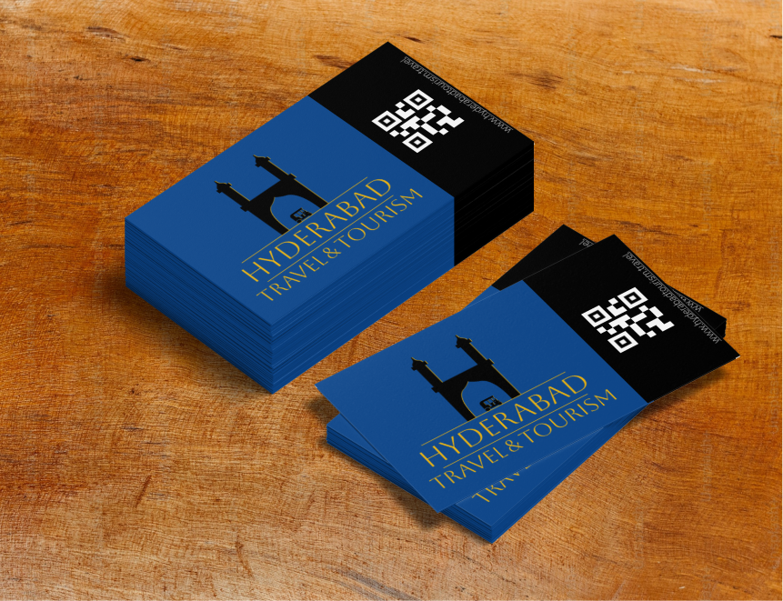
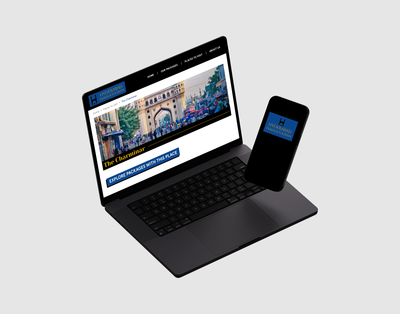
I designed a logo for a local tourism brand that runs in the city
of Hyderabad, India. Hyderabad is a city of juxtaposition with the
old and the new existing together.
The brand being a
travel agency, I wanted to convey a feeling of luxury &
sophistication. I wanted the primary color that I’ll use as part
of the redesign of the website to evoke a sense of heritage &
history. I ended up with a dark reddish brown which fit well with
what I had in mind. The secondary color I chose was a bright
yellow, which conveyed a sense of sophistication and royalty.
Using these two colors, I landed on a bright blue using the
triadic color harmony. I felt this blue was perfect to show the
contrasting modern part of the city and also helped to add a
contemporary aesthetic to the brand when included in the logo. I
wanted the primary brown to be part of the website and didn’t
include it in the logo.
After gathering peer feedback,
most people liked the logo with the monument of Charminar as it is
a well-known place of interest in India. I kept the black fill on
the monument as it resembled a silhouette. I also received
feedback suggesting there was an element of ‘tourism’ missing from
the monument logo, therefore, I added an autorickshaw to the logo
to signify tourism. The typeface used in the logo is meant to look
modern and classic at the same time, and the typeface
Aboreto was a perfect fit for the job.